Foison
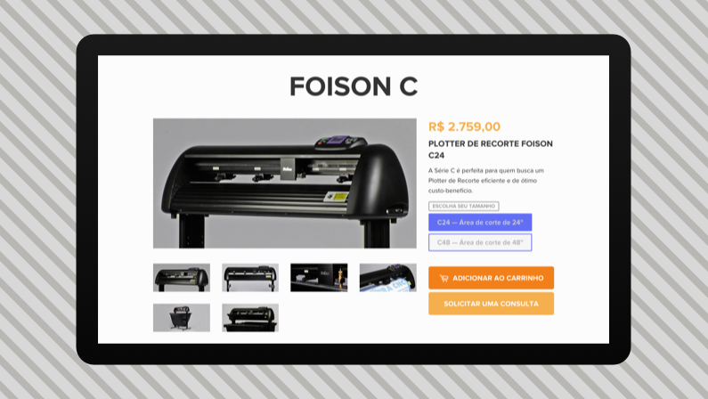
E-Commerce Website built with Shopify
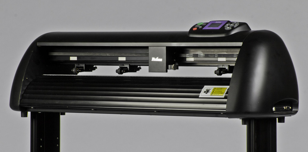
Foison is a brand for cutting plotters that distributed in Brazil by Cobra CNC, a small business owned by my family.
 This is a cutting plotter
After a few years doing web design and digital marketing for them, we figured it was time to have an e-commerce to have direct online sales — and also to replace the terrible website they had before… made by myself, of course
This project was done in collaboration with designer and photographer Luisa Fosco1 — without her superb photography and graphic design skillset, the site wouldn’t be half of what it is.
Highlights
Shopify
Shopify is an emotional roller-coaster — a great platform to work with, but full of frustrating constraints.
While it’s great not having to deal with PHP and local databases2, it comes at a price: Shopify has abysmal support for custom post types, gateway support in Brazil is severely lacking and their themes force you to keep all of your SCSS in a single monster file (unless you have a build system in place). Oh, and local development is unavailable .
It has many upsides, though. Most of the platform issues are only seen by theme developers — merchants have it really easy with Shopify. Their admin dashboard is thoroughly well designed, from media uploads to pricing updates and email notifications. All of these would add up to a ton of work if they had to be prepared outside of Shopify, either by mashing together a bunch of plugins or coding from scratch.
Information Architecture
We conducted interviews with sales and support teams and delved deep into support tickets to figure out the needs, the language and the modelling the products should have on the new site.
Graphic Design
Even though developing the site theme (based on Shopify’s Timber framework) was a huge amount of work, the base graphic design work done by Luisa was essential to make a pattern library to support further phases of the project.
Snooping on your Users to make their lives better
HotJar Analytics was an essential tool for iterating the design right after going live — seeing a playback of users visiting your site makes it so much easier to uncover roadblocks in your user flow.
Build & Deploy
Although asset handling in Shopify is dismal, I have to commend them for the command-line interface that made my life so much easier.
Using dploy.io towards the end of the development also easened a burden and allowed me to develop exclusively on a dev branch that deploys to a test store and then sends it to production on the press of a button — no more breaking changes on the live site or messing with config files.
Next step would be to add Gulp to the workflow to make asset handling more sane, but one thing at a time…
Outcomes
While visitor engagement and overall leads went up, the online sales never really took off… which is a bit disappointing, but also clear when looking in retrospect.
One reason for that might be the average ticket — for a product starting at around $1000, a traditional e-commerce setting may not work in the same way.
It may also be that, due to the highly specialized and technical nature of the product, more brand recognition is needed for a direct sale online without contact with a sales rep.
We are currently investigating options — while plan A is to gradually improve the site keeping metrics along the way, another possibility is to dump Shopify altogether and just keep the site as an online catalogue and lead generator for the sales team.
